Custom CSS
OBS Utils supports custom CSS at four scopes. Rules are injected into managed <style> tags that mount only while an overlay renderer is alive — they don’t pollute Foundry’s UI when the editor is closed.
Watch the Stream Overlay tutorial video for a visual guide on the older API (pre-V5; the four-scope model below replaces it).
DOM structure
Section titled “DOM structure”The renderer produces this structure inside each overlay container (.overlay-renderer):
<div class="obs-utils overlay"> <div class="actor" id="actor{actorID}" data-actor-name="{Display Name}"> <div class="actor-layer" data-actor-name="..."> <div class="overlay{index}" data-overlay-id="{stable-id}"> <div data-component-id="{stable-id}"> <div class="component {component-type}" id="component{index}"> <!-- per-type contents --> </div> </div> ... </div> </div> </div></div>The IDs in data-overlay-id and data-component-id are stable UUIDs that survive reorder. Use those for scoped CSS — the array-index id="overlay0" etc. are convenient but shift when you reorder.
The four scopes
Section titled “The four scopes”| Scope | Selector wrap | Edit where | Survives reorder |
|---|---|---|---|
| Global | .overlay-renderer { ... } (auto-applied) |
Composer footer → Global CSS | n/a |
| Per actor | #actor{id} { ... } |
Manage Actors → CSS button on the row | yes (actor ID) |
| Per overlay | [data-overlay-id="..."] { ... } |
Style drawer → Advanced when an overlay is selected | yes (stable UUID) |
| Per component | [data-component-id="..."] { ... } |
Style drawer → Advanced when a component is selected | yes (stable UUID) |
The Global scope is auto-wrapped in .overlay-renderer so a careless rule like .app { color: red } can’t bleed into Foundry’s chrome or another module’s DOM. The other three are scoped by construction.
Opening the Style editor
Section titled “Opening the Style editor”The Style editor is a slide-in drawer opened from a button at the bottom of the component section in the Properties panel (Layout workspace). When no component is selected, the button styles the overlay itself; when a component is selected, it styles that component.
Simple vs Advanced
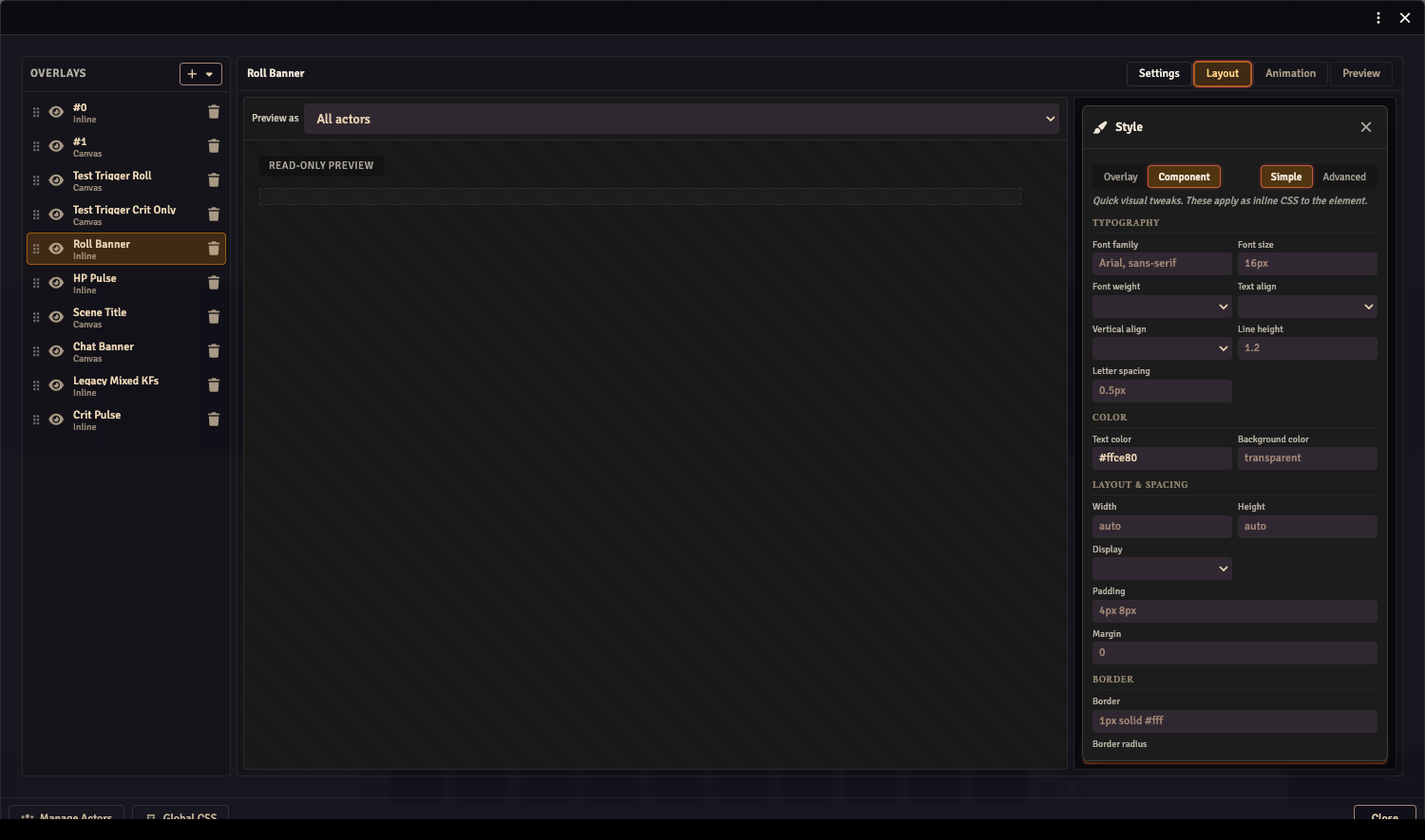
Section titled “Simple vs Advanced”Each customCSS field has a Simple mode (form fields) and an Advanced mode (raw CSS textarea). Both edit the same underlying data:
- Simple parses the CSS into known fields grouped under Typography / Color / Layout & Spacing / Border / Image. The Image group only appears on image-rendering component types (
img,bavimg,mimgav). - Anything Simple can’t represent — nested rules, pseudo-elements, unknown declarations — is preserved verbatim and shown in a read-only “Preserved CSS” summary at the bottom of Simple mode.
- Advanced shows the same CSS string raw. Edits round-trip into Simple’s fields on switch.
Nested rules and pseudo-elements
Section titled “Nested rules and pseudo-elements”For Inline overlay components, the data-component-id wrapper uses display: contents, so layout properties (padding, background, width) won’t apply to it directly. To style the inner element, use a nested selector:
i { color: gold; font-size: 22px; }img { border-radius: 50%; }progress { width: 240px; height: 14px; }progress::-webkit-progress-value { background: linear-gradient(90deg, #f55, #ff5); }Inheritable properties like color and font-* still propagate through display: contents, so they work at the top level.
Canvas component wrappers are real positioning elements — top-level layout properties work directly.
Lifecycle
Section titled “Lifecycle”The <style> tags (obs-utils-css-global, obs-utils-css-actors, obs-utils-css-overlays, obs-utils-css-components) are mounted when an overlay renderer activates and removed when the last renderer unmounts. Active renderers are:
OverlayRendereron/streamComposer(the overlay editor’s canvas, active while the Composer window is open)- The Preview workspace mode tab inside the Composer
You won’t find these style tags in the document on /game unless one of those is open. The OBS browser source keeps them mounted as long as /stream is loaded.