Overlay Editor
The Overlay Editor is where you build the overlays shown on your stream. An overlay contains components such as text, images, icons and health bars. You can arrange them in a row with Inline, or position them freely with Canvas.
Open the editor
Section titled “Open the editor”In your GM browser, open Settings → Configure Settings → OBS Utils → Overlay Editor → Open Editor.
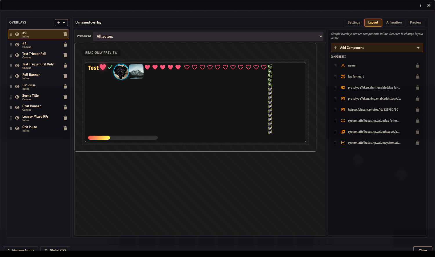
The left panel lists your overlays. Choose one to edit it. The four tabs across the top are Settings, Layout, Animation and Preview.
Make a name plate
Section titled “Make a name plate”This example displays one actor’s name. Complete Getting started first so you can check it in your OBS browser source.
- Click + at the top of the overlay list. Choose a blank Inline overlay. If the editor opens with template cards instead, choose Custom Inline.
- Open Settings and give the overlay a recognisable name, such as
Party names. Keep Tile by set to Actors. - Click Manage Actors at the bottom left. Select an actor you want to display, then close the actor selector.
- Open Layout, click Add Component, and choose Text.
- Enable Data-driven in the component’s editor, then choose the actor’s Name in the picker, or enter the path
name. - Choose that actor in Preview as above the layout. Its name should appear.
- Check the OBS browser source. The same name should appear there; the stream user needs permission to view that actor.
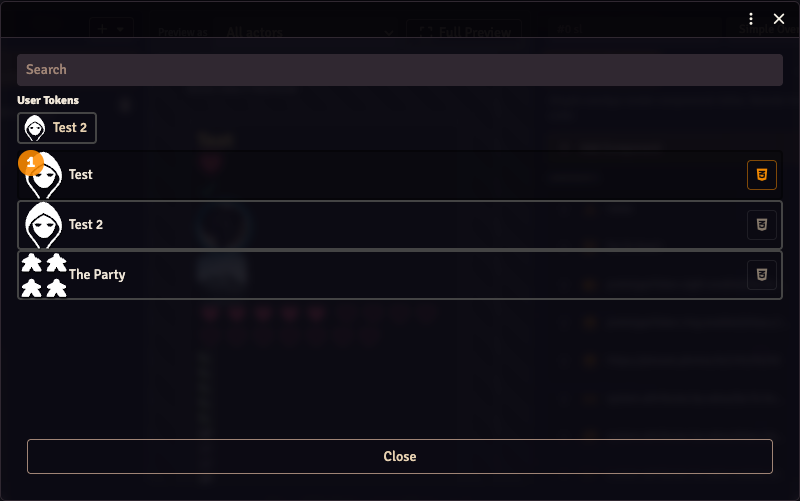
Use the search field to find actors. The User Tokens shortcuts provide quick access to assigned characters. Selecting more actors creates more copies of an overlay tiled by Actors.
Add a portrait or another value
Section titled “Add a portrait or another value”With the overlay selected, use Add Component again:
| Component | Use it for |
|---|---|
| Text | An actor’s name, a readable value or fixed text. |
| Image | A portrait or other artwork. |
| Icon | A Font Awesome icon. |
| Conditional Icon / Conditional Image | Different artwork depending on a value. |
| Icon Counter / Image Counter | Repeated icons or images representing a value. |
| Progress Bar | A resource with a current and maximum value, such as health. |
For an actor portrait, add Image, enable Data-driven and choose the portrait field img. Leave Data-driven off when you want fixed text or a fixed image instead of actor data. For system values such as HP, use the actor-value picker. D&D 5e, Pathfinder 2e and Call of Cthulhu companions add named groups of fields for their systems. You can also enter a raw data path when a field isn’t listed.
A value that isn’t present on the selected actor stays empty. Check the actor and the chosen field before treating an empty readout as zero.
Choose the layout and number of copies
Section titled “Choose the layout and number of copies”Open Settings to change the overlay’s name, type and tiling.
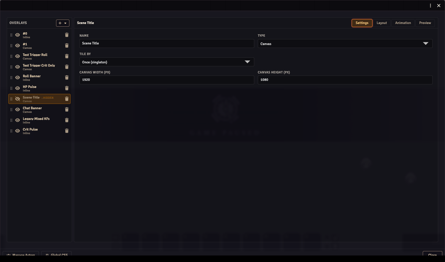
| Setting | What it changes |
|---|---|
| Inline | Components flow in a row. Reorder the component list to change their order. |
| Canvas | Components have their own positions and sizes on a reference canvas. |
| Tile by: Actors | One copy for each selected actor. |
| Tile by: Players | One copy for each active non-GM user. Useful for per-player roll banners. |
| Tile by: Users (incl. GM) | One copy for each active user, including GMs. |
| Tile by: Once (singleton) | One copy, for an overlay that should appear only once. |
| Canvas width / height | The reference dimensions used when positioning Canvas components. |
Changing the overlay type can discard layout information; read the confirmation before switching an existing overlay.
Arrange a Canvas overlay
Section titled “Arrange a Canvas overlay”Choose Canvas, then open Layout. Click a component to select it, drag it to move it, and drag its handles to resize it. Arrow keys nudge it by one pixel; Shift + Arrow moves it by ten. Escape deselects; Tab cycles through components.
The component list also controls drawing order. Earlier components draw underneath later ones. Drag its rows to reorder them.
Inline layouts have a read-only layout preview. Use the component list and styling controls to arrange those instead of dragging the preview.
Style the overlay
Section titled “Style the overlay”Select a component and click Style in the properties panel. Simple exposes font, colour, spacing, border and image controls. Use the Overlay tab in the drawer when you want to style the whole overlay rather than one component.
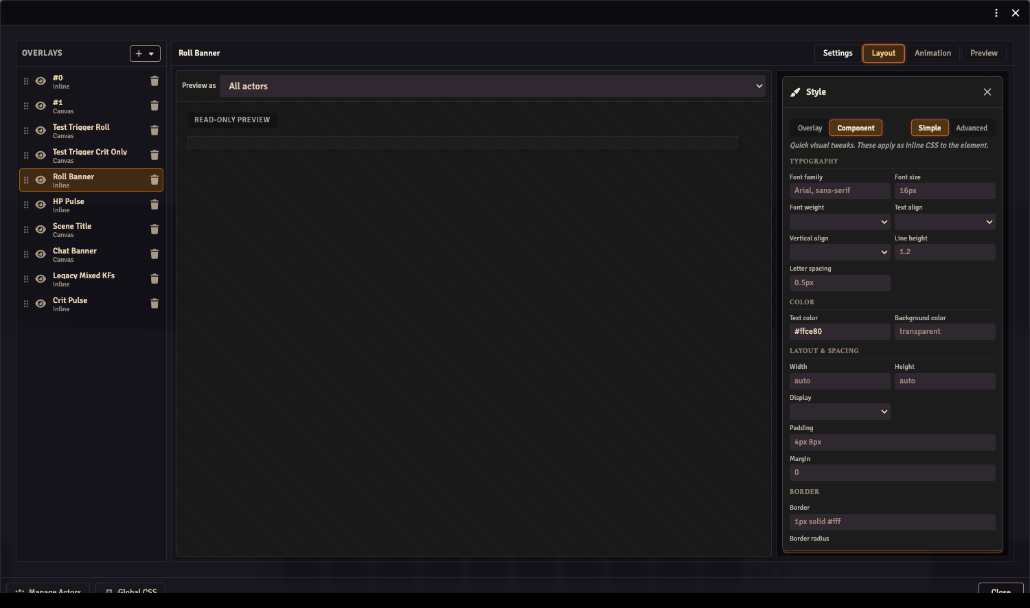
Advanced edits the CSS directly. Switching to Simple preserves declarations it can’t represent. For actor-wide and global styles, see Custom CSS.
Manage the overlay list
Section titled “Manage the overlay list”Drag an overlay’s handle to change its order. The eye button enables or hides it; a hidden overlay has a struck-through name and a HIDDEN marker. The trash button deletes the overlay.
When there are no overlays, the editor offers template cards such as HP Bar, Name Plate and Status Icons. A template creates an editable overlay. System companions can also supply starter overlays; use Import starter overlays to bring those into your world.
Preview before using it live
Section titled “Preview before using it live”Open Preview to see the overlays together. Its test-fire buttons let you try registered events, such as a player roll, without waiting for that event in the game.
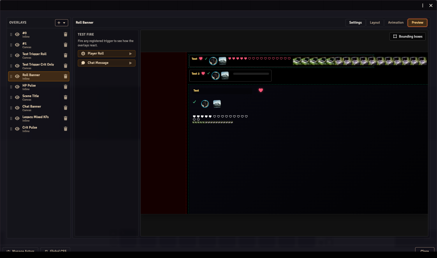
Use Overlay animations to make components fade, move or react to those events. Check the actual OBS browser source after editing: it uses the stream user’s actor access and scene, which may differ from your GM view.
Export or share your work
Section titled “Export or share your work”Use Export in the editor’s window controls. A JSON export contains the overlay configuration; a Bundle also packages referenced images. Bundles explains export, append and replace.